
September 2023
Solo Project
How might DimeDasher Destinations help users travel on a budget?
Research
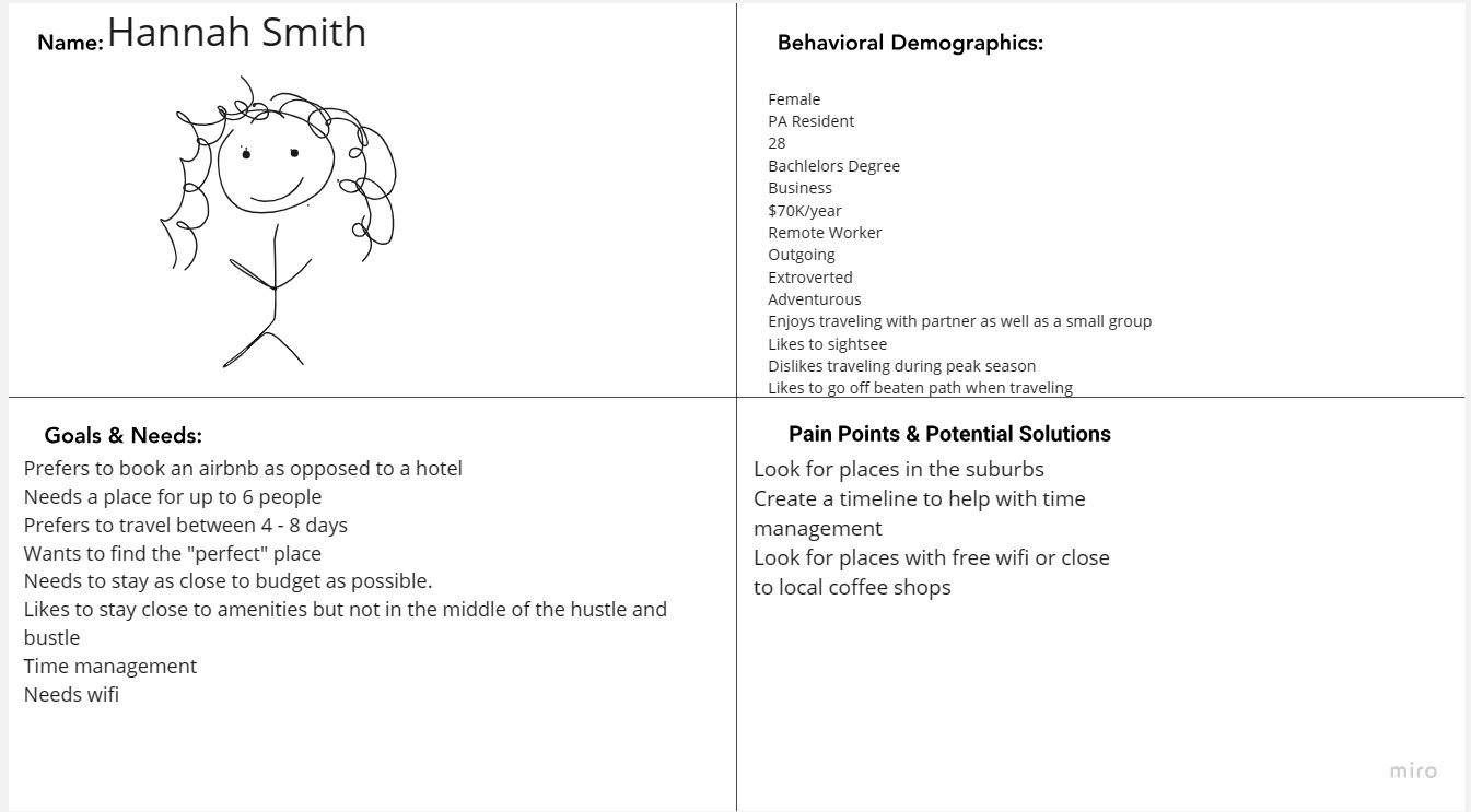
Proto Persona
Timeline: 2 weeks

“Getting everyone’s budget and making sure it’s aligned [is the most difficult part of planning a vacation].” Kristen, 34
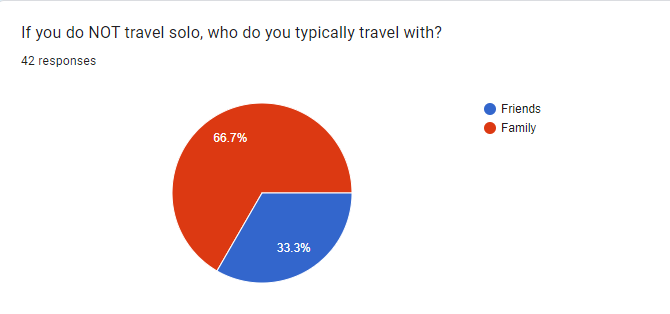
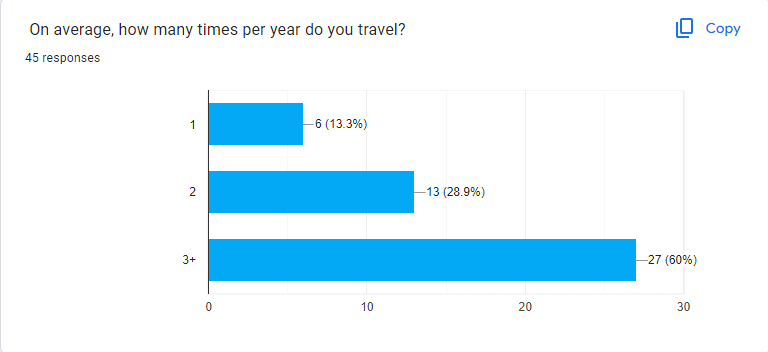
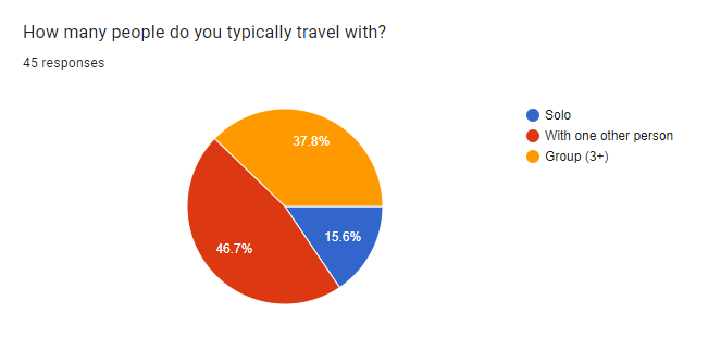
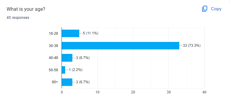
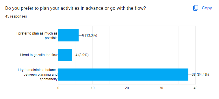
Survey Data
Ideation
My Role: UX Researcher, UI Designer
Your favorite budget friendly travel app
Interview Plan
I created an interview plan with 38 questions to ask potential users. For this project, I found users while working in various local coffee shops. I sat a sign by my laptop asking to speak to those who enjoy traveling and interviewed five travel lovers who would be interested in planning a budget friendly vacation.
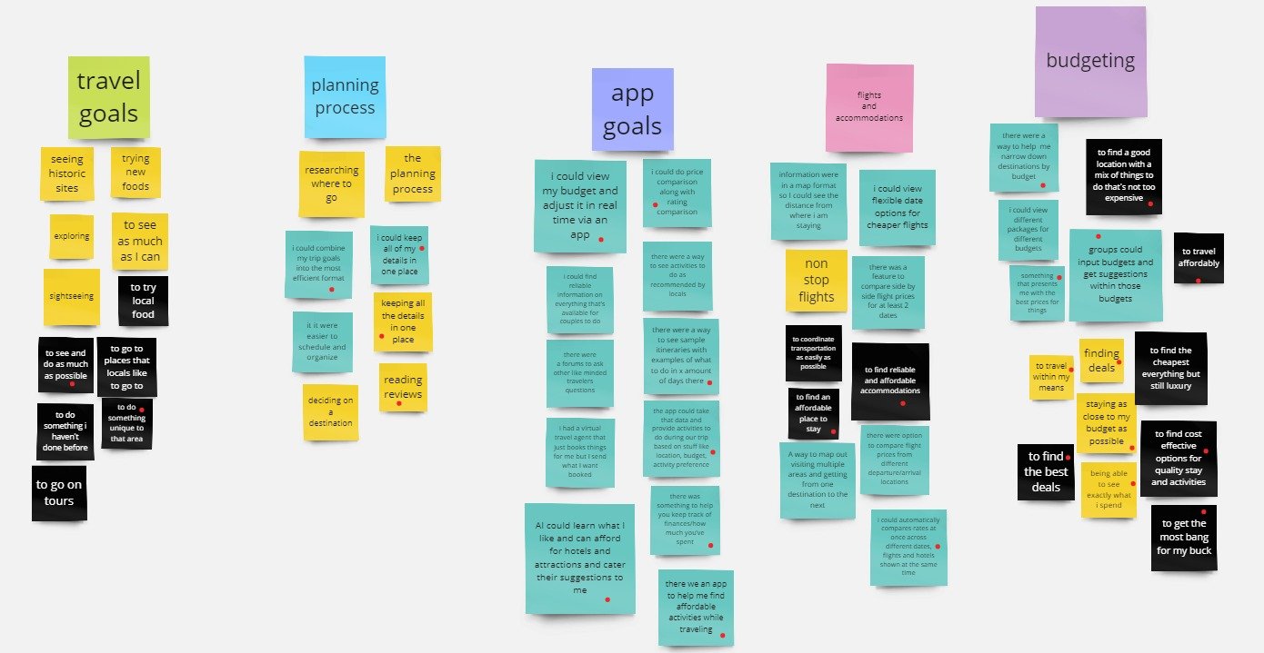
“How important is it for you to stay within a budget?”
“Which features would you like to see in your ideal travel app?”
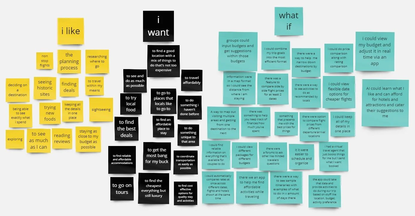
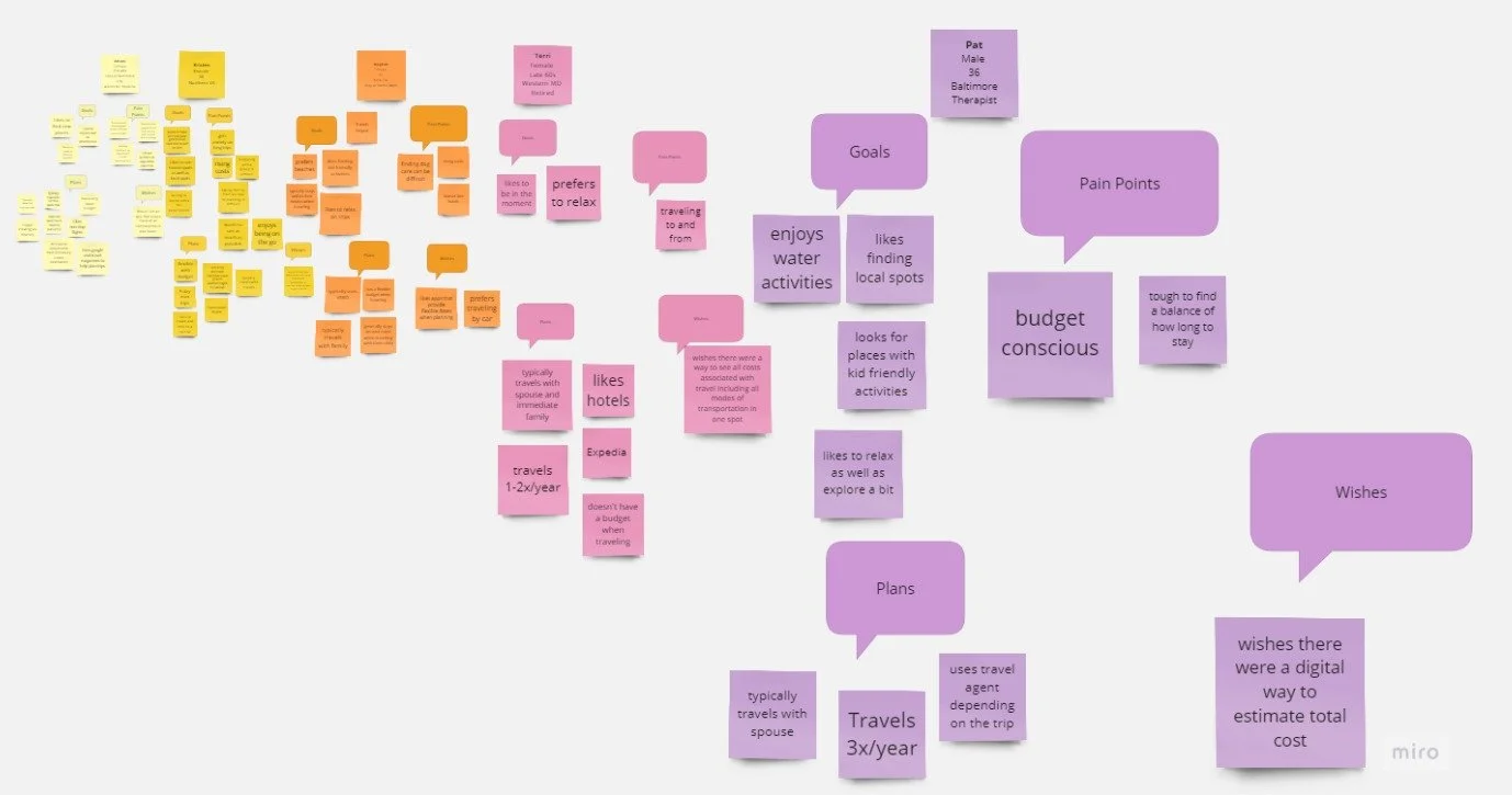
Affinity Diagram
“What are your general goals when traveling?”
Value Proposition
Tools: Figma, Miro, Google Slides
User Journey Map
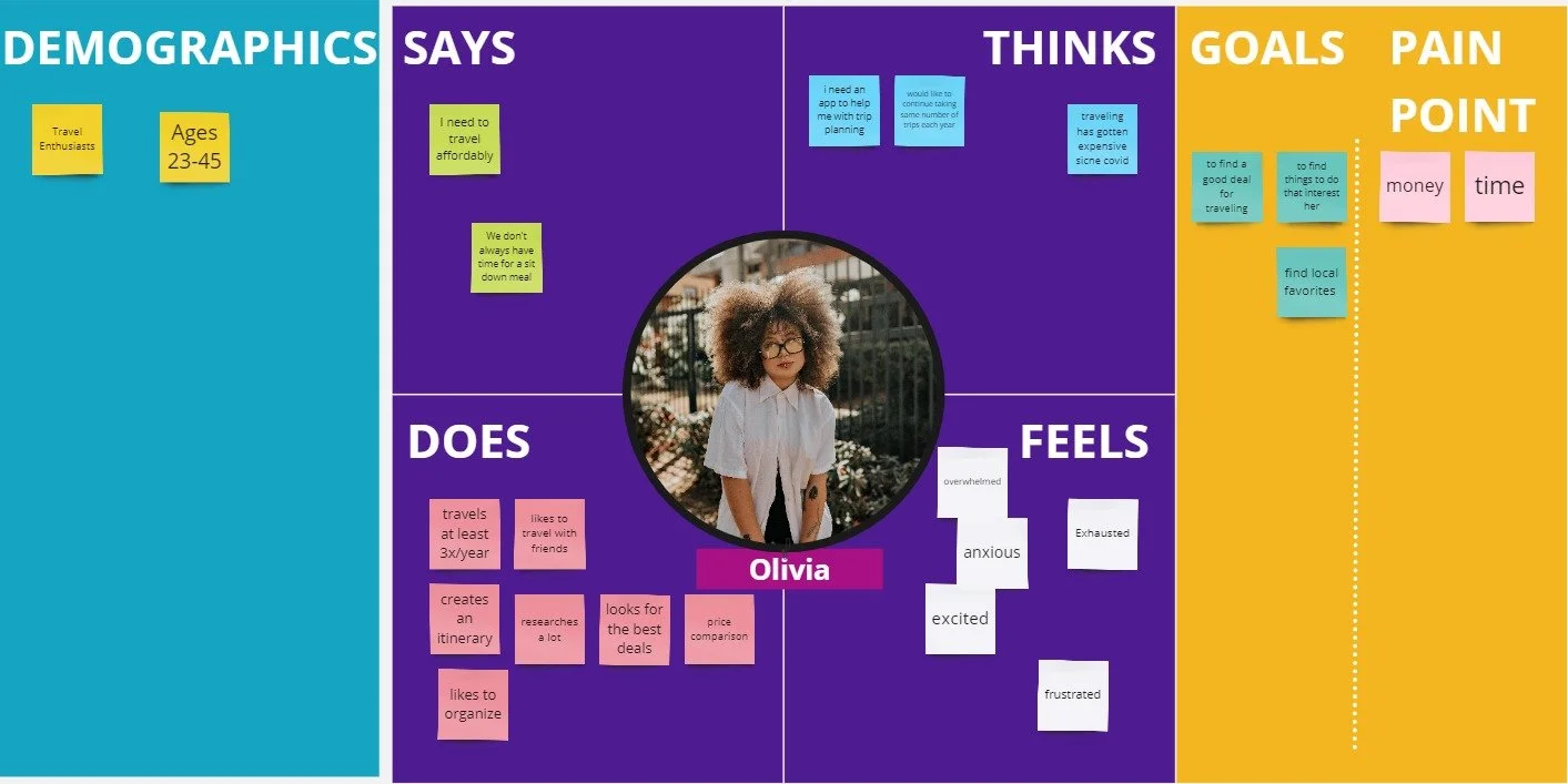
User Persona
Definition & Ideation
User Insight
Due to the rising cost of goods and services, travelers are seeking efficient and cost effective trip planning solutions. This is because travelers want to aim to avoid overspending, which can cause financial strain as a result from the planning, execution, and aftermath of a trip.
Problem Statement
Due to the rising cost of living, Olivia is seeking efficient and cost effective trip planning solutions as a way to avoid overspending and financial strain related to a trip. How might DimeDasher Destinations aid Olivia in traveling on a budget with friends?
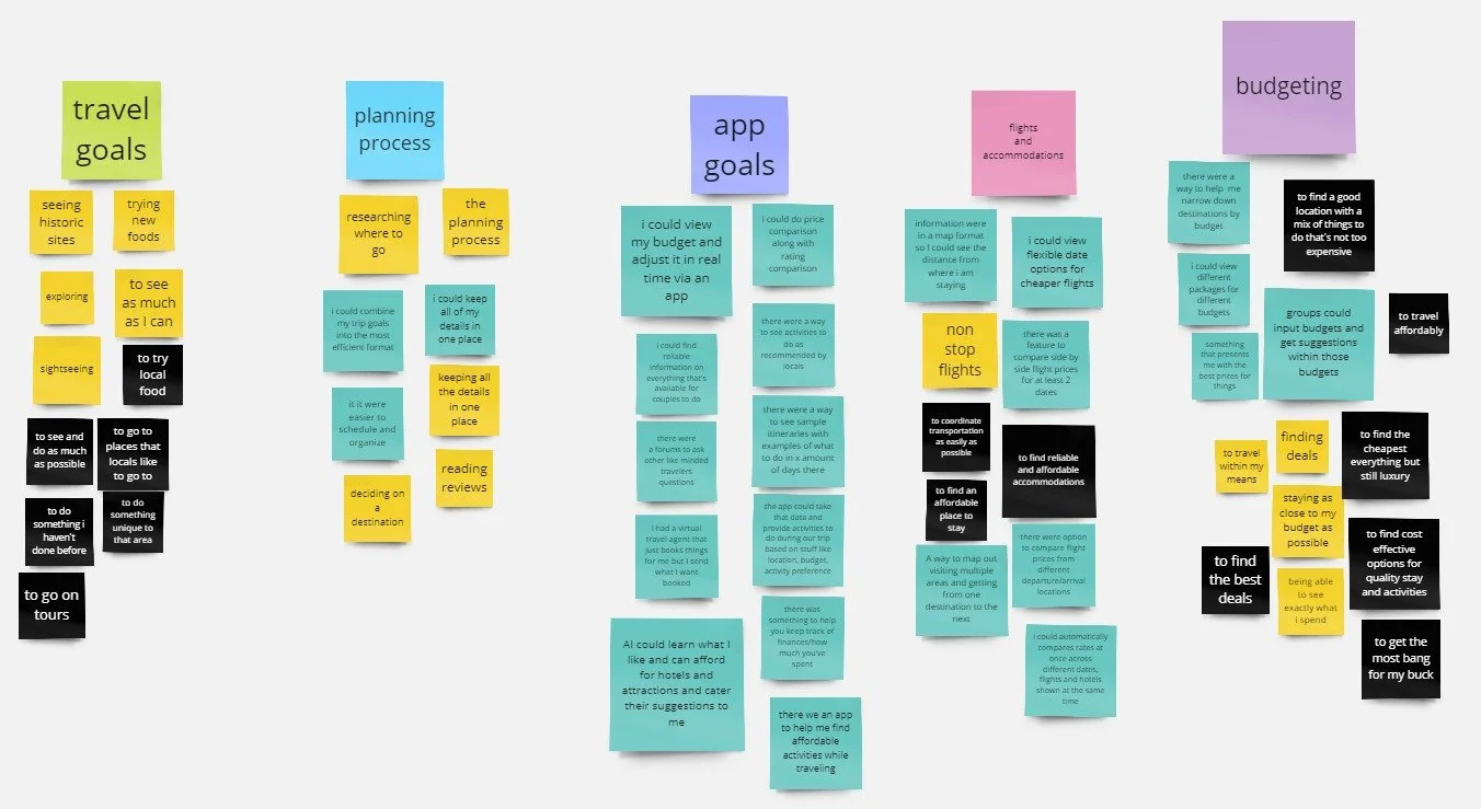
Idea Cluster
Dot Voting
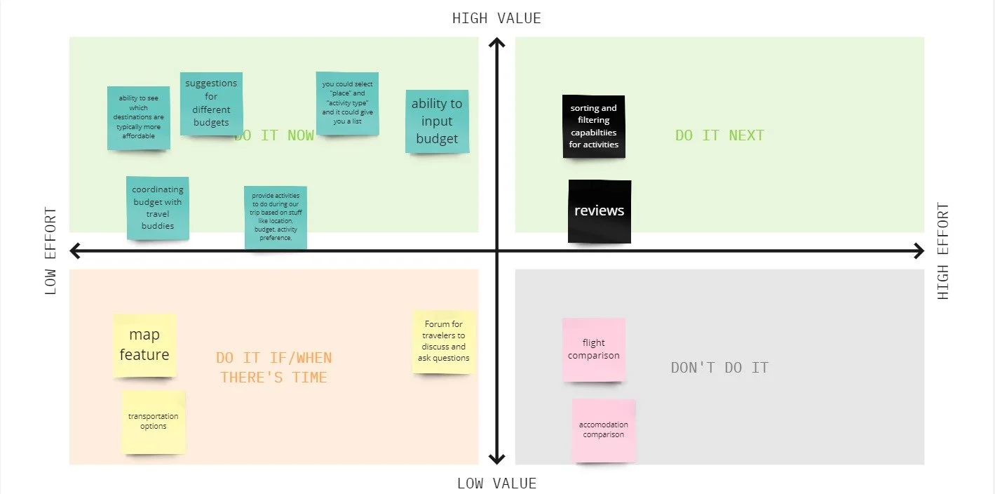
Feature Prioritization Matrix
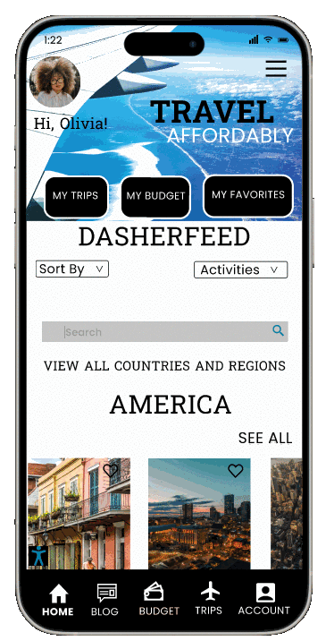
My app, DimeDasher Destinations, is a new collaborative and interactive travel app focused on developing ways to help travelers affordably and effectively plan their next trip with ease and organization.
DimeDasher Destinations is better because my app makes planning your next trip easy, affordable, and fun from start to finish.
We’re believable because DimeDasher Destinations makes planning your next trip affordable, efficient and fun for travelers of all budgets.

Prototyping
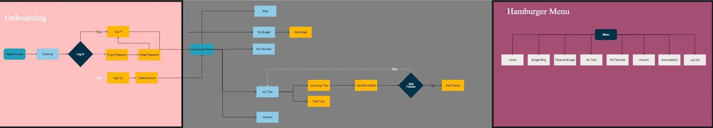
User Flow
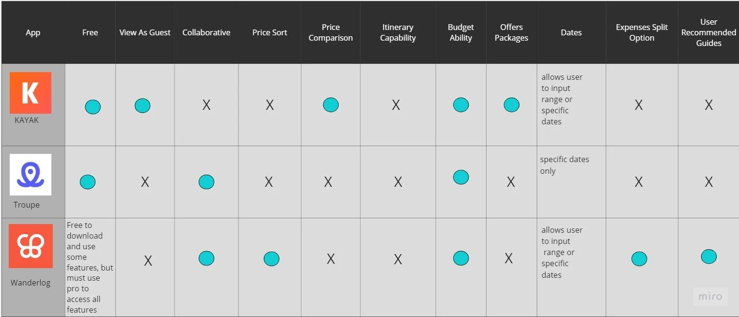
Competitor Analysis
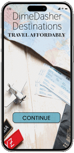
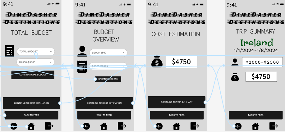
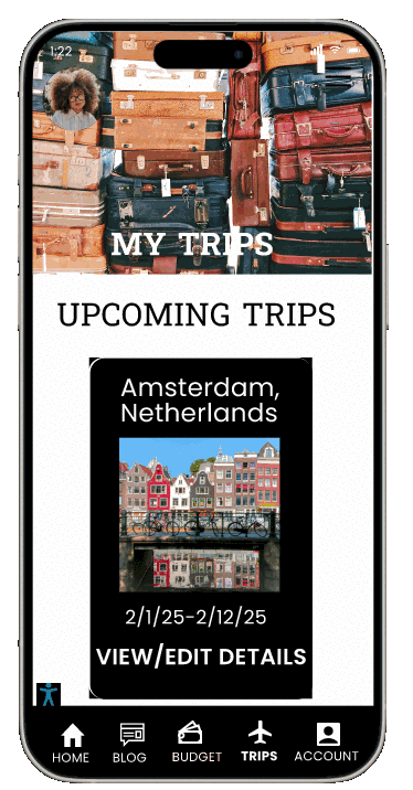
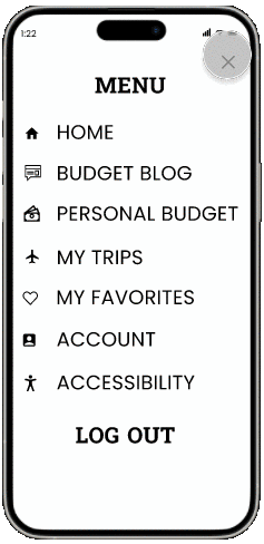
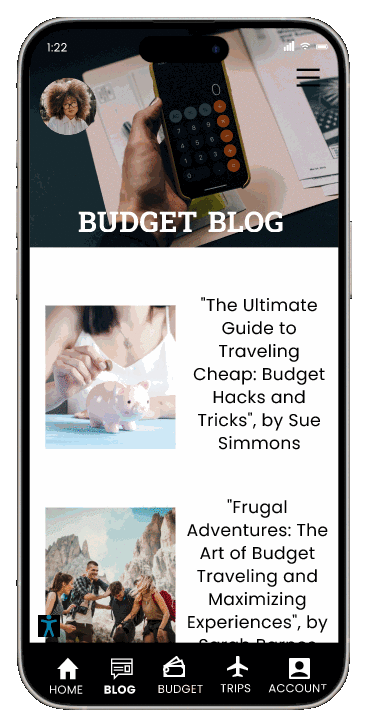
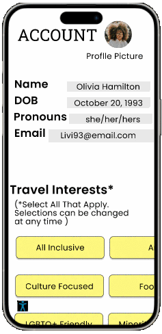
Hi-Fi Prototype
Final Thoughts and Conclusion
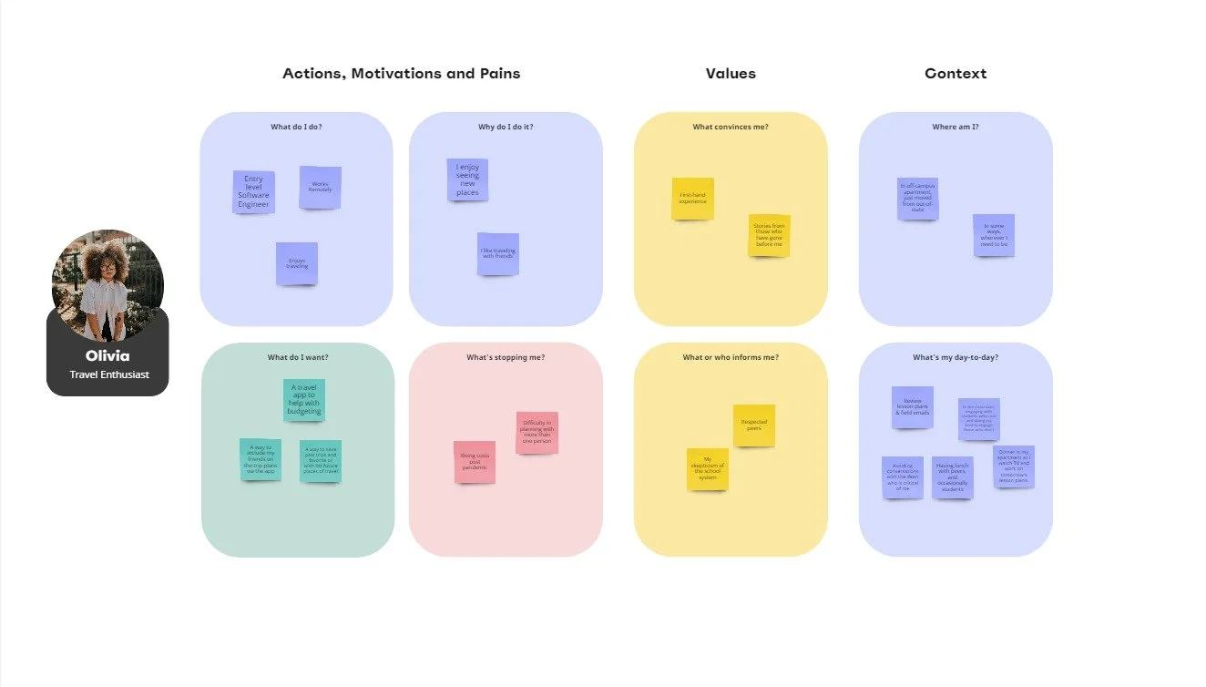
Empathy Map
Wireframe Sketches
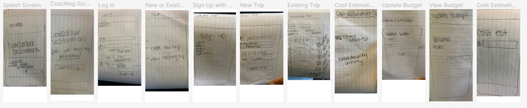
Lo-Fi Prototype


Being that this was my first project as a UX/UI student, I thought it went very well. I am proud of the way that the overall project turned out. This was a great learning experience as someone who is a first time designer.
Given more time, I would love to continue to iterate upon my design. For example, creating a curated feed based on your travel interests that were selected in the account portion of the app. I would also like to test out the hi fi prototype to gain more insight into things that can be added, removed, or improved upon for a final iteration.

Helping You Navigate Through Grief

Your Sweet Treat Pick (Me) Up
Responsive Web Design
Responsive Web Redesign